A selection of my work is available to view below. Each project’s unique details and requirements, as well as a brief description of the project, showcase the synthesis of strategy, creativity, and execution. I’m always working on new projects, so check back to see what’s new.
If you like what you see or have a project that you think we could collaborate on, let’s talk.
Top Ten USA, a third party maintenance provider for enterprise level servers and associated technologies, were looking for a "kick-ass" brand that spoke to the unique attitude of the company and stood out among the myriad boring logos of other companies in their industry.
I designed a monogram mark, inspired by the circuitry and connections of computer components. I selected a vivid orange to stand out among the blue and grey of their competitors and to remind their audience that when they see the flashing orange indicator light on their server, it’s time to call Top Ten USA.
This work was completed while employed at fatrabbit CREATIVE and is the property of the client.
As a staffing agency focusing on the IT sector, Corporate Brokers required a brand that was as up-to-date as their technology. I created their parent logo to represent their commitment to moving away from paper resumes and into digital solutions, through the image of a paper airplane in flight.
As the company grew, they segmented the divisions and required assistance creating sub-logos for each division, based on the names created internally.
From the names they developed internally, we created marks leveraging existing colors and assets to retain brand recognition with the parent brand.
This work was completed while employed at fatrabbit CREATIVE and is the property of the client.
Transit Safety Solutions grew from an industry leading rail and bus safety tech firm. They needed a brand that stood out in their industry, while highlighting a feeling of technological advancement.
Using a deconstructed “T” to create the appearance of a moving bus or train car, paired with custom typography, we created a mark that speaks to their audience. My concept of the “T” was brought to life by the creative lead for the project.
This work was completed while employed at fatrabbit CREATIVE and is the property of the client.
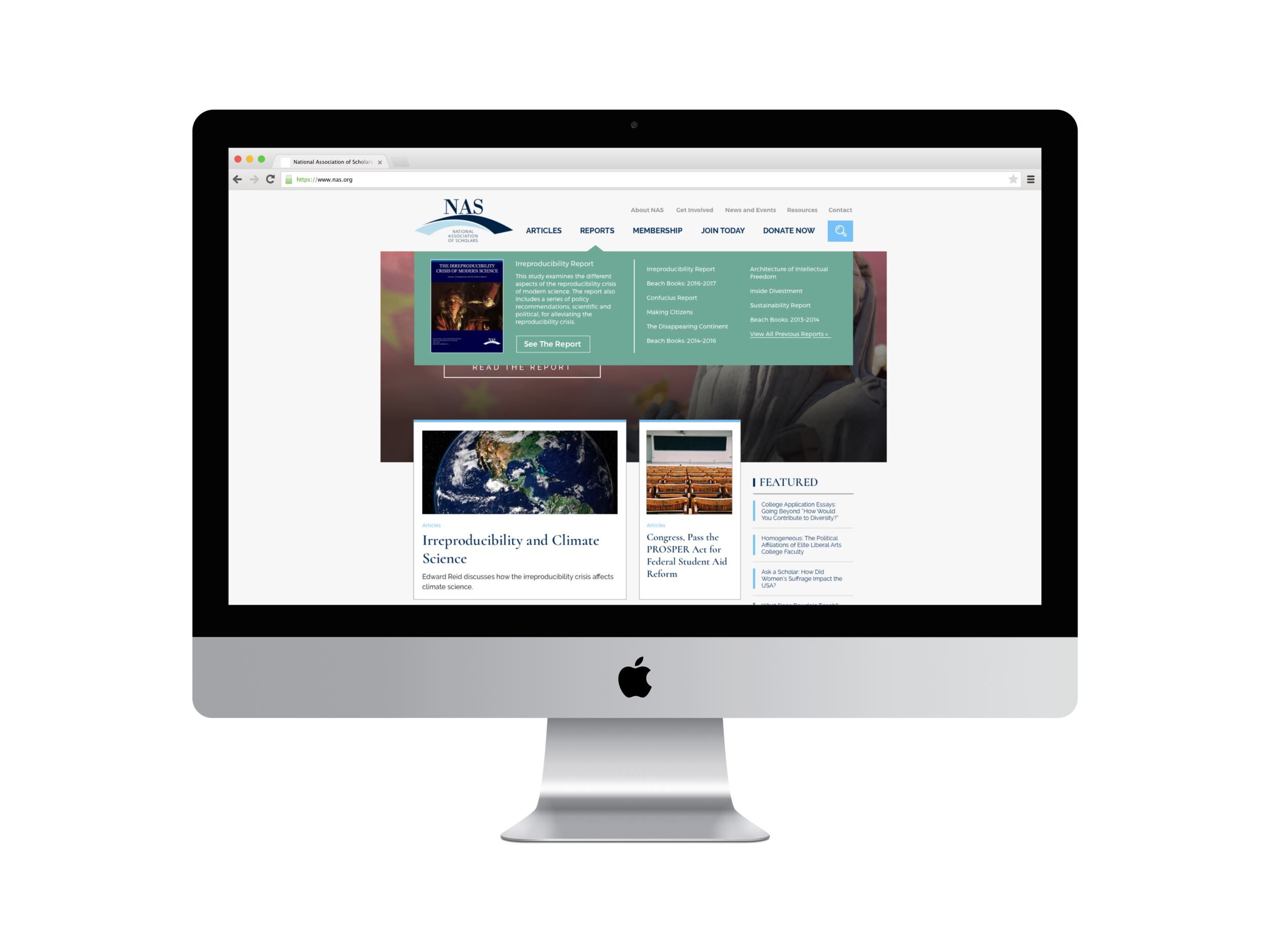
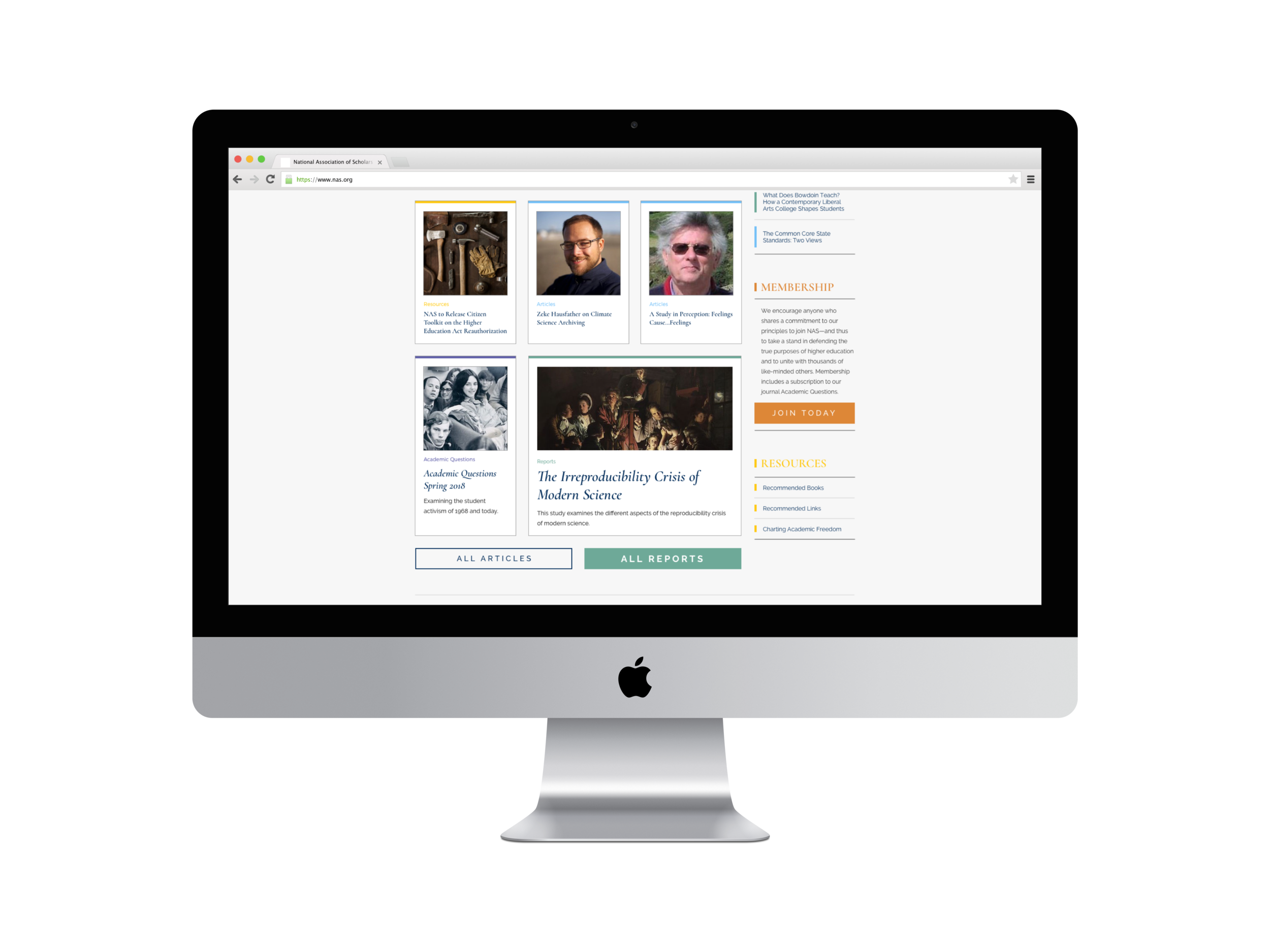
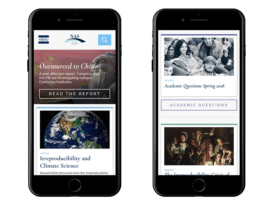
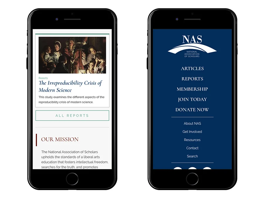
The National Association of Scholars sought to redesign their outdated website to a responsive, content-focused site that invited users to engage with the content more.
Utilizing knowledge of their audience’s wants and needs gathered through several years of managing the existing site, coupled with new information gained through user submitted survey feedback, I designed a site that prominently featured their key sections, a card style articles display, a dropdown navigation that allows for the large amount of sub-navigation, and a clear, audience-friendly search option.
Additionally, I created a visual system to identify the various types of publications based on existing brand colors, in order to allow for easier search of their incredible number of published works.
This unused work was completed while employed at fatrabbit CREATIVE and is the property of fatrabbit CREATIVE.
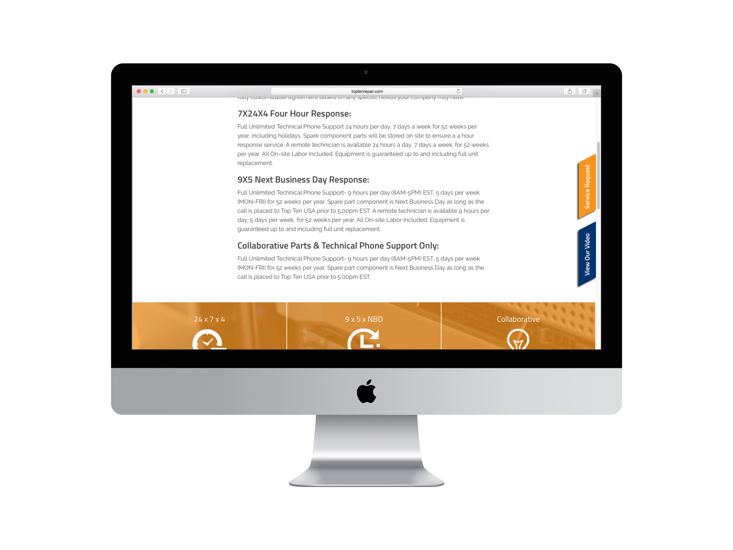
In addition to needing a new brand, Top Ten USA needed a responsive website that complemented the new look and drove home the “kick-ass” attitude of the company.
Using angular overlays and a custom GIF in the header to add a hidden touch of surprise, while maintaining a crisp, almost spartan layout, I created a website that speaks to the persona of the company, while resonating with the “get in and get out” mentality of their core audience of IT managers and specialists.
This work was completed while employed at fatrabbit CREATIVE and is the property of the client.
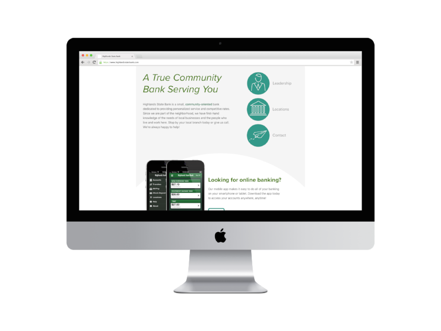
Highlands State Bank’s website required a redesign to not only bring them up-to-date with a responsive framework, and meet accessibility standards, but also to refresh a stale and dated look.
Working in tandem with the branch managers, Compliance, IT, Operations, and Marketing departments, as well as the external hosting and technology provider, we created a website that was more functional, easy to navigate, and matched the new style of the brand, while maintaining accessibility and compliance standards that meet federal regulations.
The site features a visual system developed as part of the refreshed brand to distinguish the various channels of the bank, including Personal, Business, and Technology, as well as bright photos depicting the diverse population that the bank serves.
This work was completed while employed at fatrabbit CREATIVE and is the property of the client.
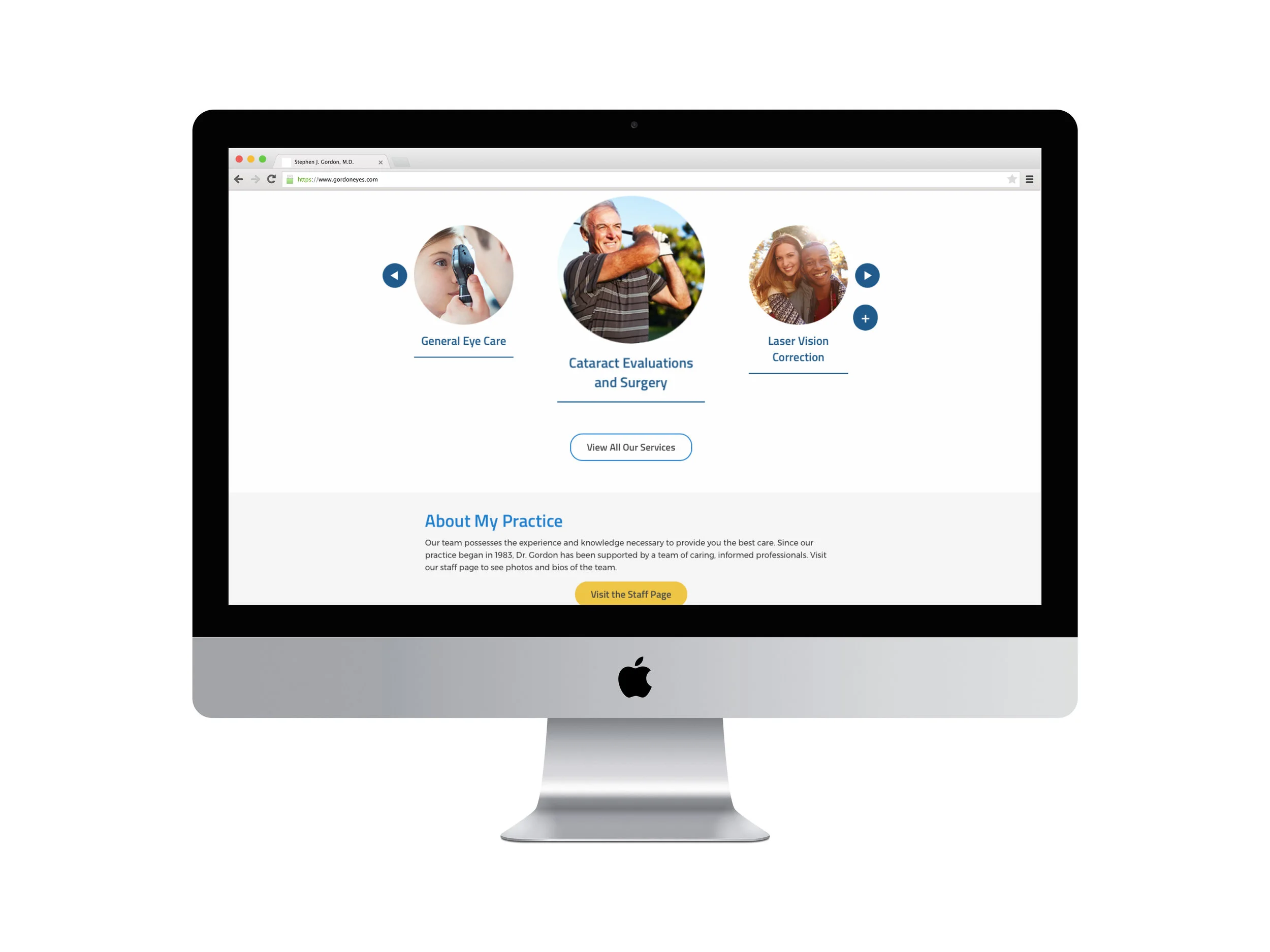
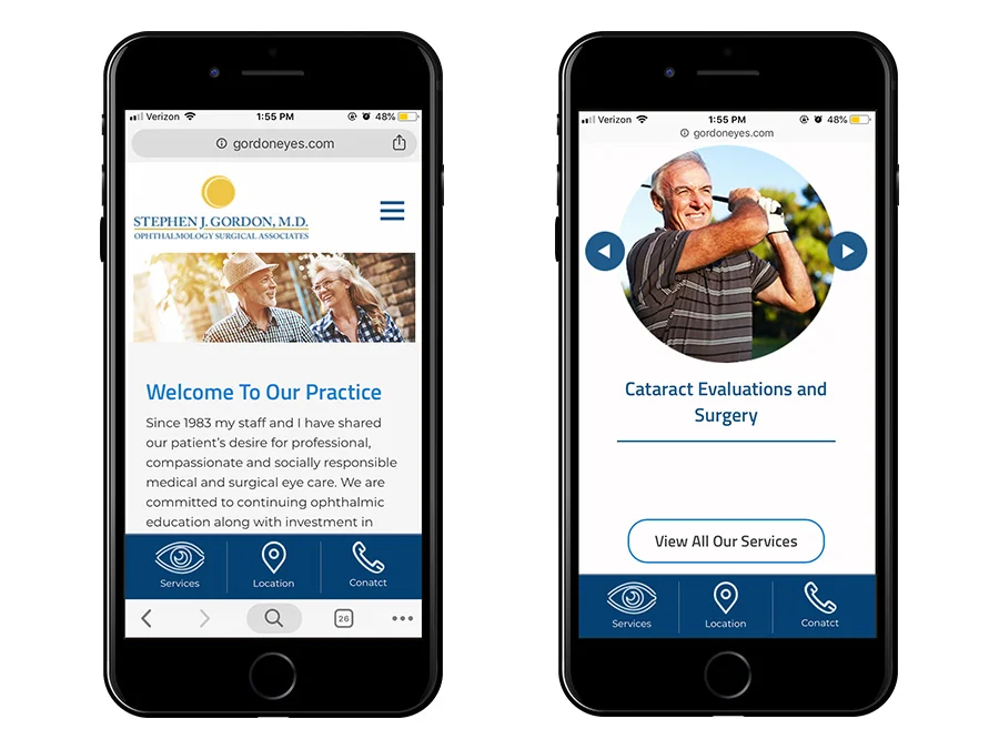
Gordon Eyes needed a responsive, user-friendly website that featured his ophthalmology and optometry services. With his audience of older individuals and their caregivers in mind, I designed a clean, concise site, with easy access to his most popular services, with a focus on imagery that showcases an enjoyment of life, rather than the medical procedures.
This work was completed while employed at fatrabbit CREATIVE and is the property of the client.
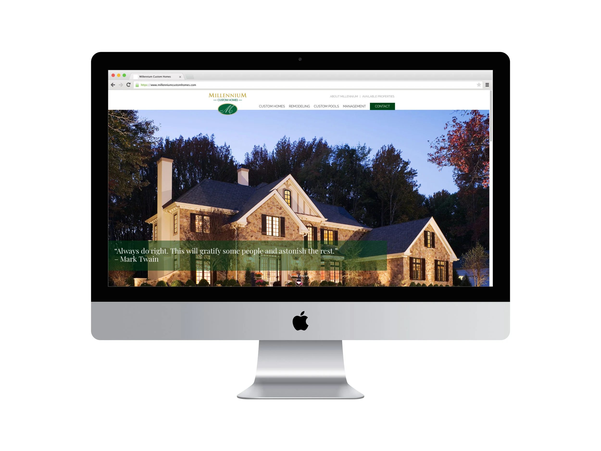
Millennium Custom Homes lacked a website that conveyed the stunning and lavish custom construction and remodeling they do and needed a way to showcase their work for potential customers.
Inspired by the provided photography, I created a website that showcases the best of their work and projects an air of elegance and luxury that attracts the proper audience while retaining an light, and open feeling to avoid distracting from the star of the show, the stunning homes.
This work was completed while employed at fatrabbit CREATIVE and is the property of the client.
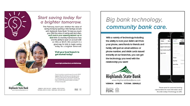
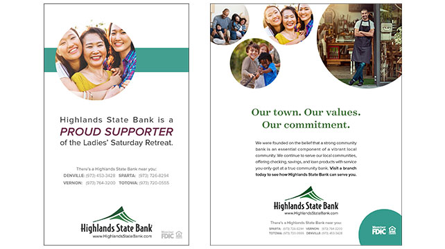
Highlands State Bank needed a marketing department without the cost of staffing a team internally. Working closely with their Vice President of Marketing, Compliance, and Operations teams, I maintained brand standards using inherited assets until our recommended brand overhaul was approved.
Some of the work completed for Highlands State Bank included maintaining the website’s frequent changes and producing campaign specific landing pages, as well as strategizing, coordinating, and designing marketing campaigns through their social media platforms, email marketing, printed and digital advertising, direct mail postcards, and in-branch signage and collateral.
Additionally, during the process of redesigning the outdated website to a responsive site with easy access to their most visited pages, we completed the brand overhaul in which I developed a visual system to segment products and services in their marketing, which was in use until their acquisition.
This work was completed while employed at fatrabbit CREATIVE and is the property of the client.